How I Turn a Drawing Into a Lino Block For My Linocut Prints
Of all the stages that go into a print, carving is where the drawing becomes something real. A flat sketch is transformed into a physical block that can be inked and printed, and it’s at this stage that a design either comes to life or quietly falls apart.
The block I start with
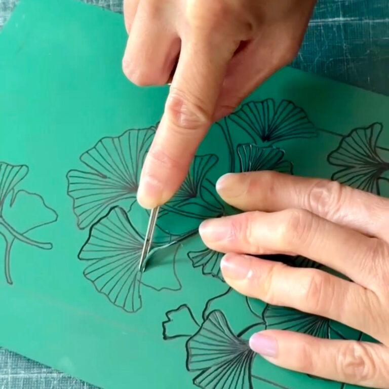
Before any of that, it’s worth a word about the block itself, because it’s a lovelier material than most people expect. Most of my prints are carved into traditional artist’s lino — the classic sort printmakers have used since the 1890s. Despite the slightly industrial name, it’s a genuinely natural product: solidified linseed oil (pressed from flax), pine rosin, finely ground cork and wood, and a little limestone, all set onto a woven hessian backing. The word linoleum even comes from the Latin for flax and oil. The blocks I use are around 3.2mm thick with a smooth surface, non-toxic, and take both oil- and water-based inks happily.
For some pieces, though, I use Japanese vinyl instead. Developed specifically for printmaking, it has a slightly softer, more consistent surface that allows for exceptionally fine detail and delicate, flowing cuts. It carves differently from traditional lino, but shares the same satisfying process of revealing an image by removing everything that won’t print. I choose between the two materials depending on the character I want the finished print to have.
I like that both materials have their own quiet logic in my work. Traditional lino has a direct connection to the natural world, made largely from renewable plant-based ingredients, while Japanese vinyl offers a precision that’s perfect for more intricate designs. Whether I’m carving lino or vinyl, there’s something deeply satisfying about creating images of plants and wildlife through a slow, hand-carved process. For nature-inspired prints, it feels like exactly the right place to begin.
Everything happens in reverse
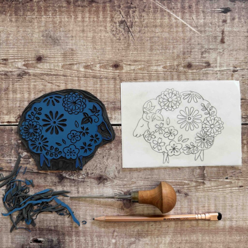
The first thing to get your head around is that a linocut prints as a mirror image. Whatever I carve into the block appears reversed on the paper, so before I cut a single line I transfer my drawing onto the lino the “wrong” way round using the simple pencil-and-tracing-paper method.
With many of my botanical linocut designs, the natural symmetry of leaves and flowers means the reversal is barely noticeable. Even so, it’s a step I never skip. It’s much easier to spend a few minutes flipping the design at the start than to realise halfway through carving that everything is facing the wrong way — especially if your design includes text, which would otherwise print back to front.
Carving away, not drawing on
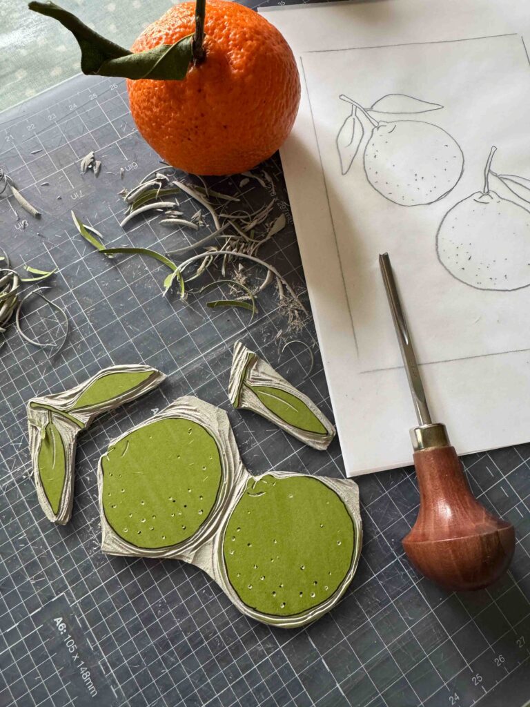
This is the mental shift that makes linocut what it is. Every cut is about defining the image by taking material away rather than adding to it. Anything I carve away stays free of ink and prints as the white of the paper; everything I leave standing holds the ink and becomes the image.
So carving is really a series of decisions about what to keep. With a seed head or a sprig of leaves, I’m constantly choosing which lines earn their place and which can go, until only the essential shapes are left raised. That interplay between the carved and uncarved areas — the positive and negative space — is exactly where linocut gets its bold, graphic character, and it’s the quality I lean into most in my work
The tools, and the marks they leave
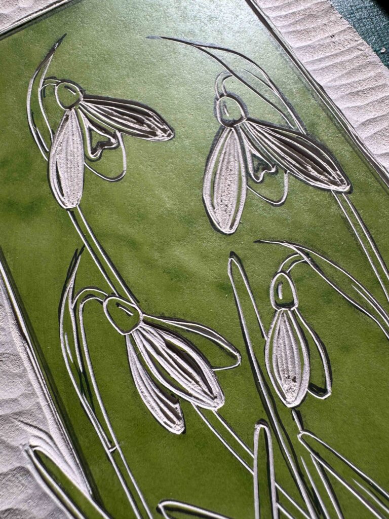
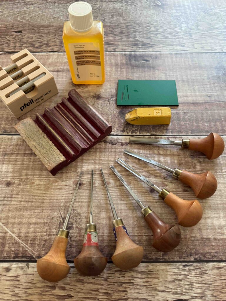
I carve with a small set of gouges, and each one leaves a different kind of mark. A fine V-shaped tool cuts sharp, narrow lines — ideal for outlines and delicate detail. Wider U-shaped tools scoop away broader channels and clear the larger open areas of background efficiently. For the very smallest details, I’ll switch to a fine knife.
A lot of the craft is simply matching the tool to the job: a crisp botanical outline wants a different blade from a soft, cleared background. I also vary the depth and width of a cut to change the weight of a line, which is how a design gains rhythm rather than looking flat and uniform. Little of this is fixed — every block teaches you something new about which mark does what.
Botanicals and wildlife ask for different things
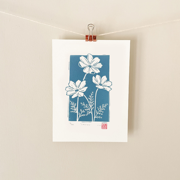
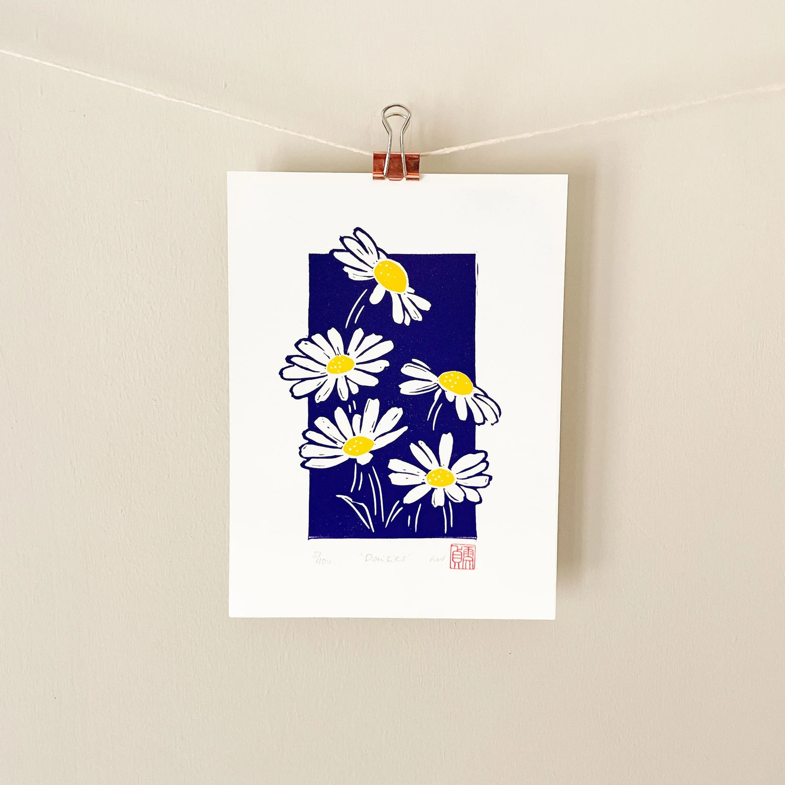
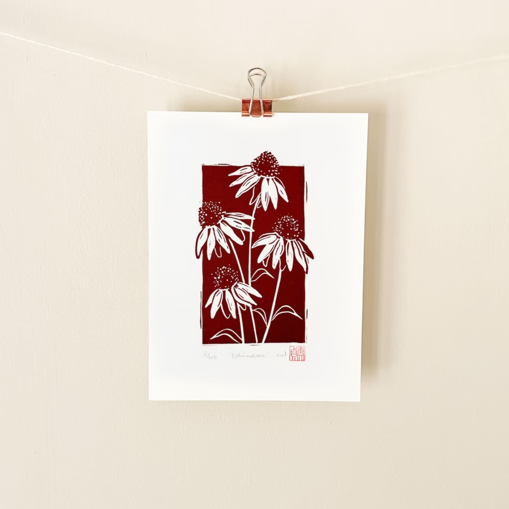
My botanical prints tend to be about clean, confident lines: the curve of a stem, the edge of a petal, the structure of a leaf. There the carving is precise and fairly restrained, letting the shapes speak for themselves.
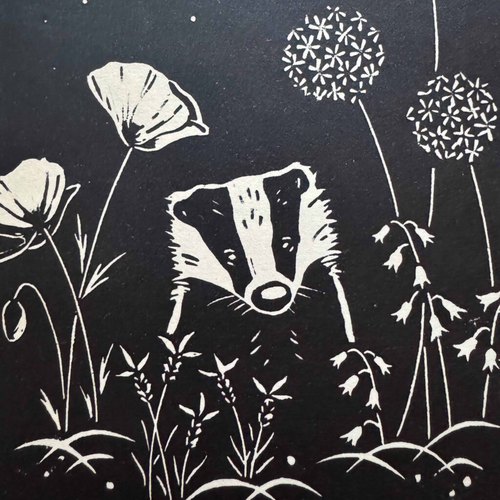
Wildlife is a different challenge. When I’m carving a hedgehog, a badger or a garden bird, the goal is character — and the temptation is to over-carve, adding fussy marks to explain every detail. I try to resist that. A few well-placed cuts to suggest fur or feathers usually does far more than a hundred anxious ones, and it keeps the animal feeling alive rather than laboured. Knowing when to stop is honestly half the skill.
Slow, sharp, and no going back
Carving rewards patience more than anything else. You can always take a little more lino away, but you can never put it back — so I work slowly, starting with shallow, cautious cuts and deepening only where I need to. Rushing is how mistakes happen.
Sharp tools matter enormously here too. A blunt gouge tears rather than glides, ruins a clean line and is far more likely to slip, so I sharpen as I go. And I always carve in a direction away from my other hand — a small habit that saves a lot of grief. Once the block is fully carved, cleaned up and proofed, it’s ready to ink and print — but by then the hardest thinking is already done.
The quiet part I look forward to
For all the technical detail, carving is the stage I find most absorbing. It’s slow, focused and a little meditative — just me, a sharp tool and the block slowly emerging into something recognisable. It’s also where each design really becomes mine, cut by cut.
If you’d like to see how these carved blocks turn into finished pieces, you can take a look at all my Linocut Prints in the shop — a growing collection of hand-carved botanical and wildlife linocut prints, each one starting life as a plain block and a drawing in reverse.